
Cartographers and Wikipedia
Wikipedia is home to poor cartography and pointers for people that want to help

There have been two problems plaguing the Feature Article process on Wikipedia. The first is that Featured Articles have been trending towards more niche subjects over the past decade. This is in part a way to restrict the amount of information to be synthesized to a manageable size. The other is that there is a backlog of Featured Articles that have not been reviewed in over a decade. Without a gardener carefully pruning an article to make sure it stays at Feature Article quality, it will degrade and become overgrown with trivia over time. Four thousand articles need to be reviewed to make sure that this has not happened. To remedy these problems, I am running a contest. I will make a map for the first two people to bring a core article up to Featured Article standards, in the next 6 months. Similarly, the two people who review the most pre-2010 Featured Articles in the next 6 months will get a map.
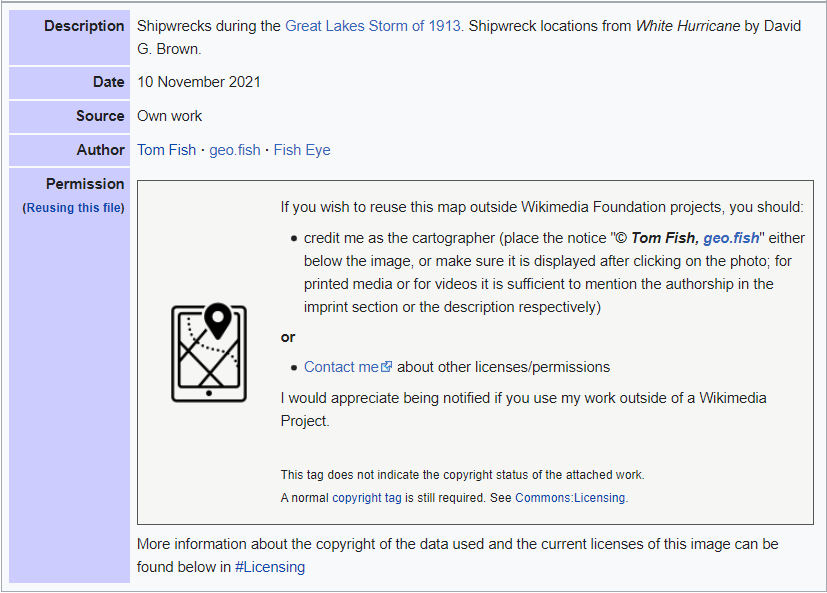
When I announced this challenge, SandyGeorgia, a frequent collaborator on Wikipedia, asked me to take a look at the map of the ships that sunk in the Great Lakes Storm of 1913. It turns out that in 2007, the original cartographer copied more from White Hurricane by David G. Brown than is allowable and created a copyright issue. This was holding up the Featured Article Review of the article.

The request seemed easy enough and in 2 hours, I used the data in my datastore to make the first draft of a replacement map, above. Since it was for Wikipedia, I felt that it would be incorrect to use Bell Topo Sans and instead used Linux Libertine (the Great Lakes) and Linux Biolinum (everything else). After some comments from three editors, I uploaded a version to Wikipedia (without my bug in the corner). In total, I went from a request to map in a Featured Article, with revisions, in 10 hours. The final map can be seen below.

Wikipedia needs more Cartographers
My experience yesterday, shows how much Wikipedia needs cartographers. A task that was 6 hours of my work, tops, had the potential to stall a review. While this is the one that was brought to my attention if you look through articles, the maps are of varying quality.
For example, British logistics in the Siegfried Line campaign is a current at Featured Article Candidates (FAC). The article uses three maps. All of them are from the 1940s and are hard to read. Similarly, Chinatown MRT station is at FAC. There is a map showing where it is on the Singapore MRT network and a map of the unbuilt Marina Line, but no map showing where this station sits compared to other landmarks.
This is not to say that everything is bad. Hamilcar's victory with Naravas uses an uninspiring map to show you where Carthage is and a fantastic map by Harrias showing all of the troop movements in the campaign. Similarly, Capture of Sedalia uses a great map of Price’s Raid by Hal Jespersen and difficult to follow map of Pettis County, MO to explain the battle.
All of these articles are probably going to become Featured Articles in a month or two and will be examples of Wikipedia’s best work. It is hard to see them as high-quality encyclopedia articles when they have such hard to understand cartography.
Things to do and not do
If you are interested in making maps for Wikipedia articles here are some dos and don’ts
Do make a user template
Wikimedia Commons allows users to have templates to standardize how the metadata about the file looks. Part of this, you can link to your website and portfolio. You can also have a template that states how you should be credited when the image is used outside of a Wikimedia Foundation project.
Don’t add watermarks to your maps
While not a policy, the informal consensus Wikipedia and Wikimedia Commons is that maps can not have “promotional” watermarks or bugs in the corner. Files with watermarks may be seen as spam and be deleted.
Do show the copyright of each layer
One of the things that make maps different from other kinds of files is that each layer that we use, allegedly, is subject to copyright. The best way to track this information is to list out the copyright status of each layer. This may be overkill, but this will become useful when the file is used in a Featured Article and reviewers are trying to establish the copyright status of the map.

Don’t contribute avant-garde work
Wikipedia is an encyclopedia and the maps need to be readable by a wide variety of people from every part of the world. Because of this, clarity is more important than artistry. Remember that all files on Wikimedia Commons are available to all Wikimedia projects. A good map should be able to work on both the English Wikipedia as well as the Xhosa Wikipedia. To me, the trade-off in artistry is worth it to help smaller projects.

Do release the map under a free license
To be used on Wikimedia Foundation projects, a map needs to be released under a fairly permissive license. They can force derivative works to be released under the same or a similar license, but can not forbid derivative works or commercial use. This is a sticking point for people, like myself, whose income depends on the maps that they make. Because my substack is so open, I can probably spin anything I make for Wikipedia as content. Not everyone has that luxury.
