The Struggles of the Perfect Transit Map
Simplicity is key
Two days ago, this phenomenally bad take landed on Twitter. To figure out why it is bad, we need to take a deep dive into cartography and compare Google Maps to other map apps. Google is not an outlier here.


Cartography
Jeffery Tumlin’s screen grab of Google Maps is at what I am going to call a city scale. City scales are particularly difficult for cartographers trying to make a general-use map because there is a temptation to put extra detail onto the map that are best suited for a specific map (of just the bus routes, for example) or a map of a neighborhood. "What does a good road map look like at a regional or city level?" is a solved problem. "What does a good multi-modal transportation map look like regional or city level?" is a much more open question.
The “better” map that Tumlin proposes is a hard to read monstrosity that is the result of a cartographer trying to put too many details onto a map. I personally have a very hard time reading this map and figuring out what is going on. Now, I have never been to San Francisco, so it is likely that a long-term SF transit rider would have an easier time reading this than me.
One of the most important tools in a cartographer’s toolset is the use of color. Color is a powerful tool because it makes it easy to distinguish between items quickly. (This is why many transit systems from London, to DC, to Hong Kong use a different color from each line). The “better” map wastes color space on the base map. When the cartographer used color in this map, they used four colors: maroon, dark blue, gray, and pink. Transit lines are maroon and dark blue while cordoors of high frequency transportation are in pink. After looking at the two legends, I cannot tell what the distinguishing feature of the maroon lines are. The train lines (BART and CalTrain) are in gray but are almost invisible unless a viewer expands the map to full size. The pink cordoors looked to me like halos around the maroon lines and not feature in their own right until I looked at the legend for a fourth time.
Google maps
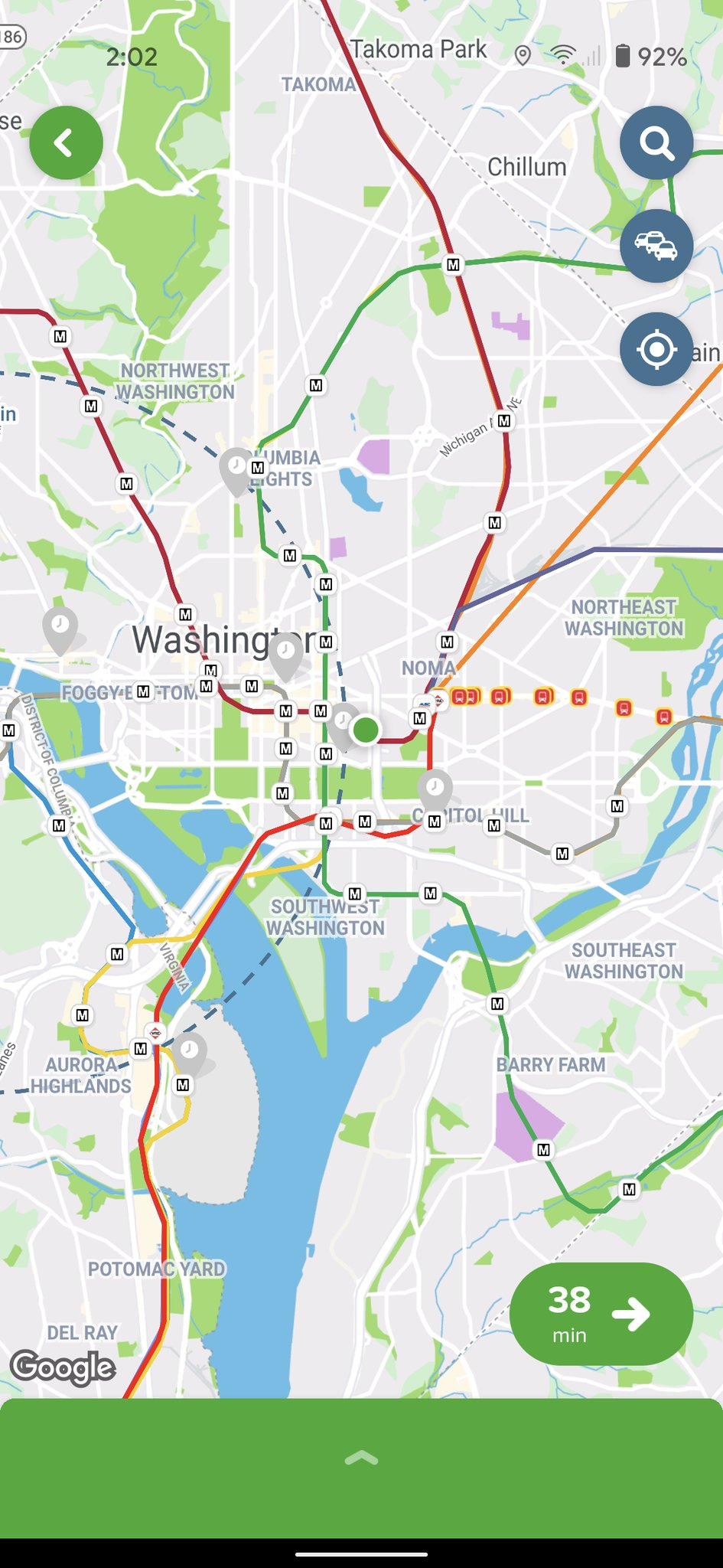
To solve this problem, Google Map’s cartographers decided to go with a much more simplified view of a city. For example, here in DC the city-wide map in google maps shows only the most important roads in its base map.
The only transit lines shown are rail and streetcar lines. This has definite downsides. As Tumlin correctly points out, bus lines are more often used by low income riders. The problem is that there are many more bus lines than rail lines. There are a few bus lines that have swift headways here in DC. If I was going to make a DC transit map, I would include them before I included the underutilized streetcar. BeyondDC’s 2012 map of 15 minute headways would be a good starting place of the bus routes to include.
At a neighborhood-level, Google Maps shows bus stops, but not the individual bus routes.
International perspective
Luckily for us, the two most popular transit-routing apps Transit and CityMapper are based outside of the United States. We can use them to compare with US-based Google Maps to see if Google Map’s choice are a result of the US’s car culture or if they are best practices.
Transit
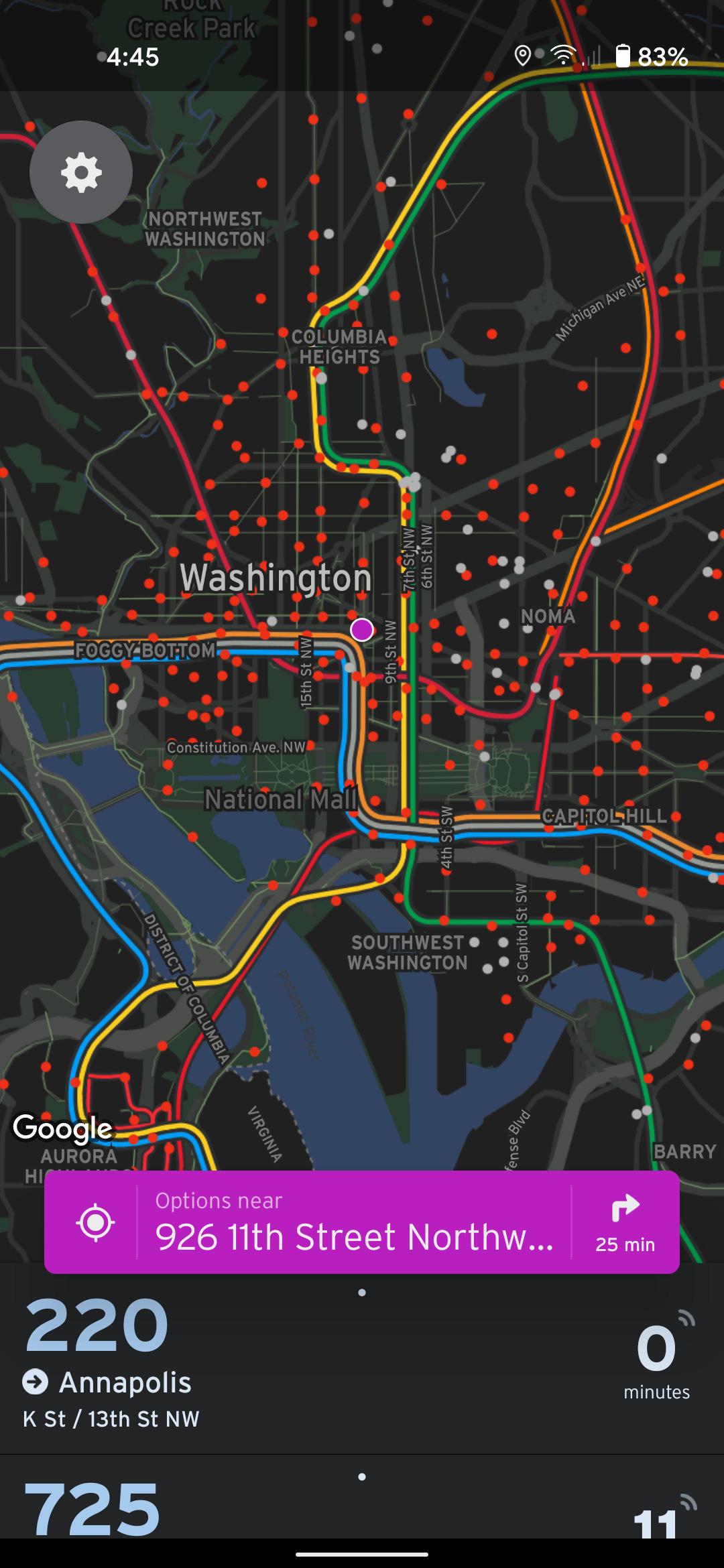
Montréal-based Transit looks very similar to Google Maps. At the city-level the defining difference is that the docked bikeshare is shown with gray and red dots depending on if there are bikes at that dock or not. The most frequent bus routes are nowhere to be found. Like Google Maps, Transit shows the DC street car with a similar weight to Metro lines. Unlike Google Maps, Transit also includes commuter rail such as VRE as if it was similar to a Metro line.
At the neighborhood level, Transit shows a wide variety of docked bikeshare, dockless bikeshare, and scooters. I find this dizzying array of colors to be distracting and not very useful. The roads highlighted are roads with bike lanes. The bus stops are nowhere to be found and the bus routes do not appear.
Transit shows less bus infrastructure on its map than Google Maps and continues the trend of not showing bus routes.
CityMapper
CityMapper is a London-based transit routing app and is very similar to both Transit and Google Maps. The largest difference is that CityMapper shows the DC streetcar shown as a row of stops instead of as a line. The most frequent bus routes are not shown on the map.
Like Transit and unlike Google Maps it shows dockless bikeshare and scooters at the neighborhood-level. The dockless bikeshare and scooters are more undertandable here than on Transit, but I wish that they didn’t turn on unless you zoom in more. Like Google Maps and unlike Transit, it shows bus stops. But, like both of the apps, bus routes are nowhere to be found.
Conclusions
Making a useful transit map is hard. Both Transit and CityMapper fall into the trap of including too much information at times.
Not displaying bus routes is a standard of the digital mapping industry. It isn’t because Google engineers hate transit or all drive cars.
The most frequent bus routes should probably be shown on all three of these maps.
Both Transit and CityMapper are available in a limited pool of cities. Google Maps is the only one of the apps that is global in scale.


