


Ohio-11 Primary Results and Bad Election Maps
Use more bivariate symbologies

I had a post written and prepared to go live at 8:30 AM EDT instead of this one. Fortunately or unfortunately, depending on who you are, the primary election for the 11th Congressional District in Ohio was on Tuesday. I promised 93deci, who was a committed volunteer for the Shontel Brown Campaign, that I would make maps and a post about the race if and only if Shontel Brown won. In an upset, Shontel Brown won. So here is my post; we are going to Cleveland.
Mapping the Ohio-11 Race
If you are not hopelessly addicted to the news cycle like I am, you probably missed that Tuesday, 3 August was the primary day for two Congressional Districts in Ohio. Barring an act of god, the district near Columbus is going to go Republican. The other district is Marcia Fudge’s district (Ohio-11) before she was appointed Secretary of the U.S. Department of Housing and Urban Development. Barring a very different act of god, this district is going to go to the Democrats.
The Ohio-11 Democratic primary pit Shontel Brown, Nina Turner, and a cadre of also-rans against each other. This primary would be uneventful except for the fact that Nina Turner has spent the last 5 years being a leftist firebrand. In the 2016 primary, she was a surrogate for Bernie Sanders and, in the general election, declined to endorse Hillary Clinton. In 2017, she became the president of Our Revolution. Turner then served as a co-chair of Bernie Sanders’s 2020 primary campaign and compared voting for Joe Biden as “eating a bowl of shit” in the general election and also declined to endorse Biden. Shontel Brown is the type of straight-laced center-left politician that you would expect to find in a race like this. Needless to say, the primary quickly became a civil war between the progressive and centrist factions of the Democratic party.
The polling showed that Nina Turner had the advantage. However, in an upset, Shontel Brown, a member of the Cuyahoga County Council and Chair of the Cuyahoga County Democratic Party, won with 50.18% of the vote to Turner’s 44.52%. The precinct by precinct values are in the map below.
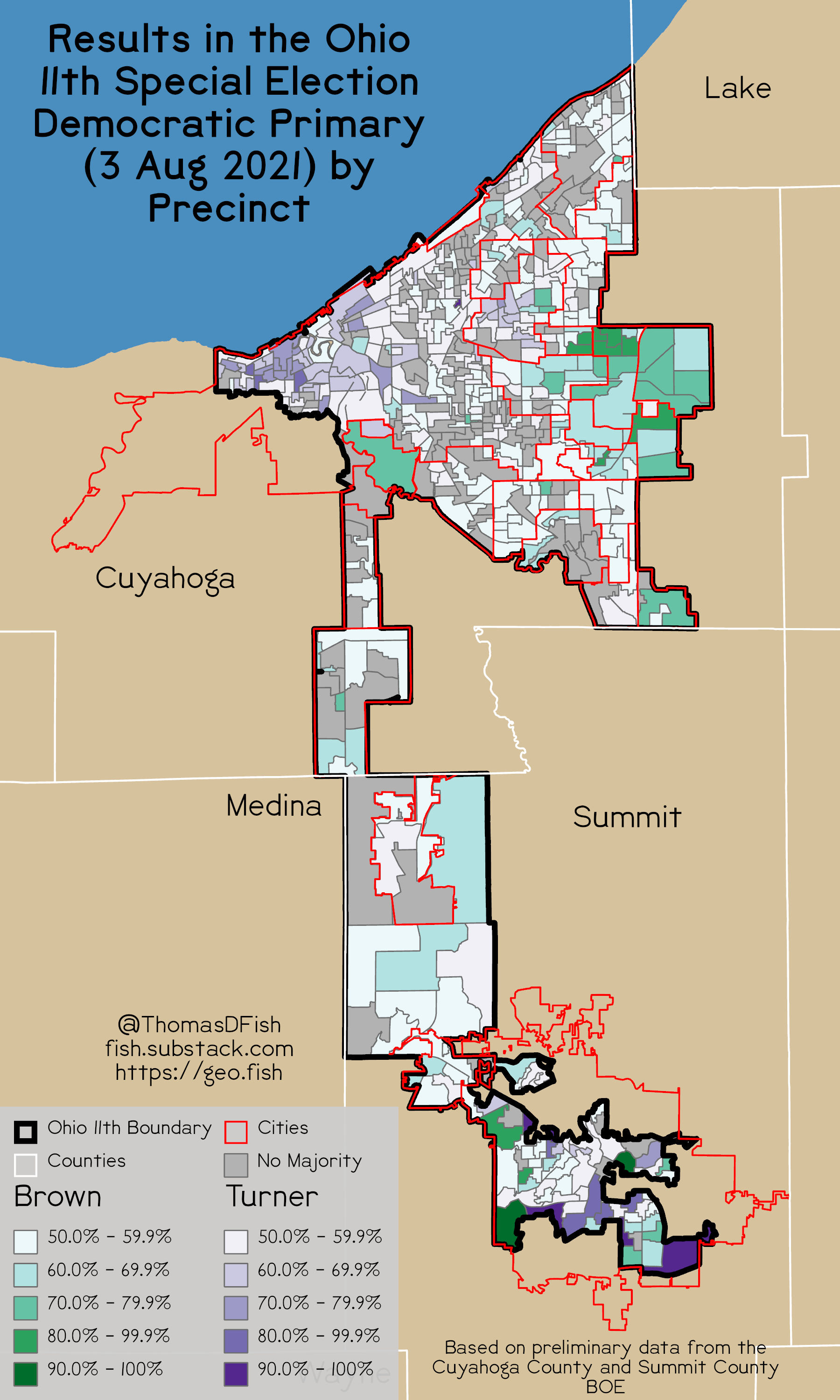
You can clearly see how tight the race is. In many precincts, neither Nina Turner nor Shontel Brown cracked 50%. It is extremely rare that either candidate wins a precinct with more than 70% of the vote. The only exceptions are in Akron (the furthest south city shown) and in the eastern suburbs of Cleveland.
Bad Election Maps
This style of map is popular in the media and on Twitter. The New York Times released an interactive version of this kind of map for their Mayoral Primary. A map a lot like this makes the rounds on Twitter shortly after any election. There is even a community, known as Election Twitter, which makes maps in this style of past and current elections.1 The problem is that this map is a terrible map. It is made even worse when cartographers flatten complex multi-member races into two-candidate races.
The problem is that precincts are not equal. They are made to be tabulation zones for elections and not much more. In the map above, areas of drastically different populations are given the same exact weight. Some precincts for this election had 466 votes cast in it others had 2.
There are ways to avoid this problem. One of them is to report results at larger areas, such as assembly districts, that are designed to have equal populations. Another option is to report at the county level. Counties do not have close populations, but there are ways to show that information to viewers. If you really want to report elections at the precinct level, you need to consider a map like this.
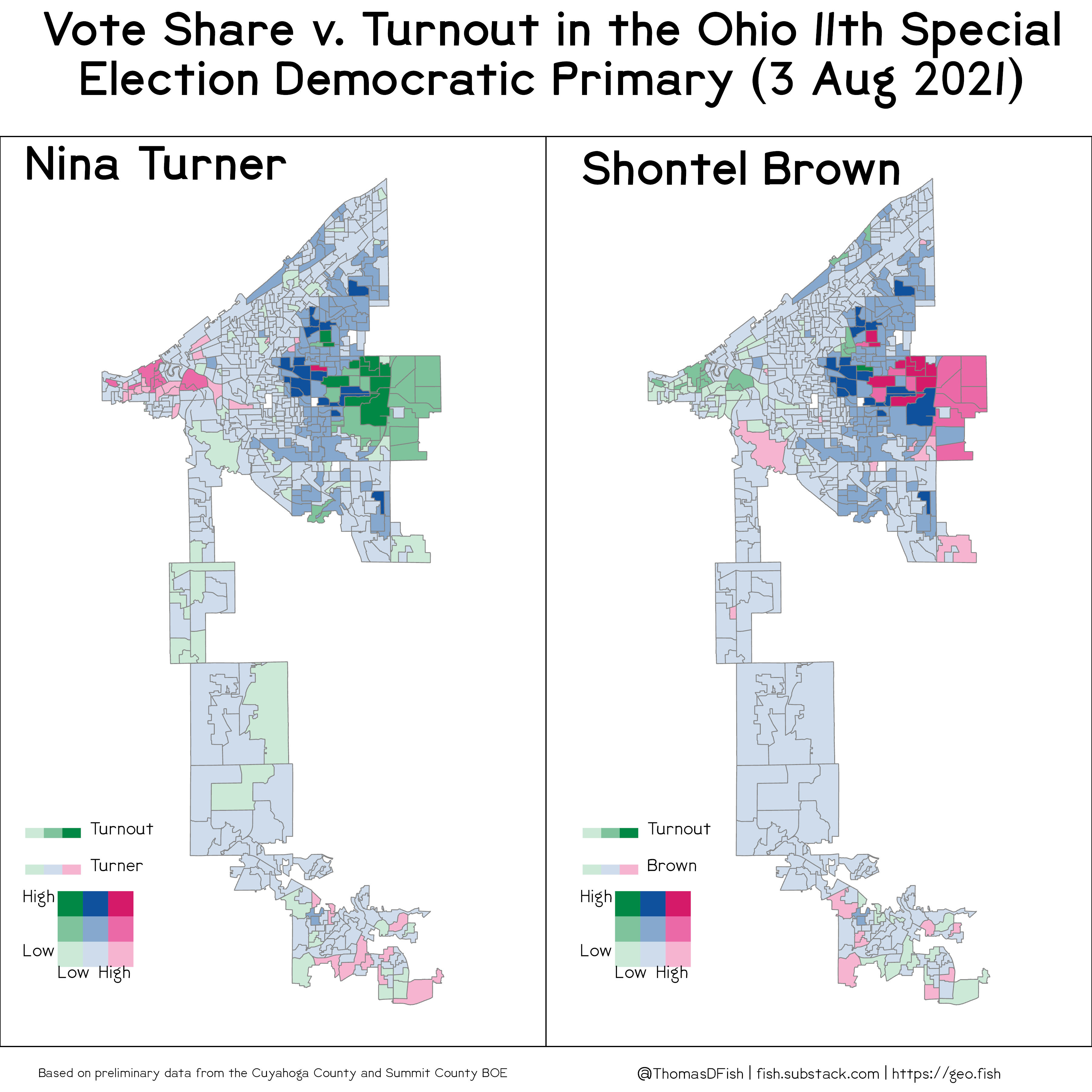
This weird map uses a pair of bivariate symbologies, or is colored using two different variables at the same time. The axis that controls the intensity shows turnout. The other that controls color shows the proportion of the vote by a candidate.2 We can see that the turnout was low across much of the district. The places with high turnout were near the western flank of the district in Cleveland, the suburbs to the east of Cleveland, and parts of Akron.
If we want to compare Turner and Brown’s performance directly, without writing off the also-rans and weighting things evenly, you can also do that through a bivariate symbology as well.
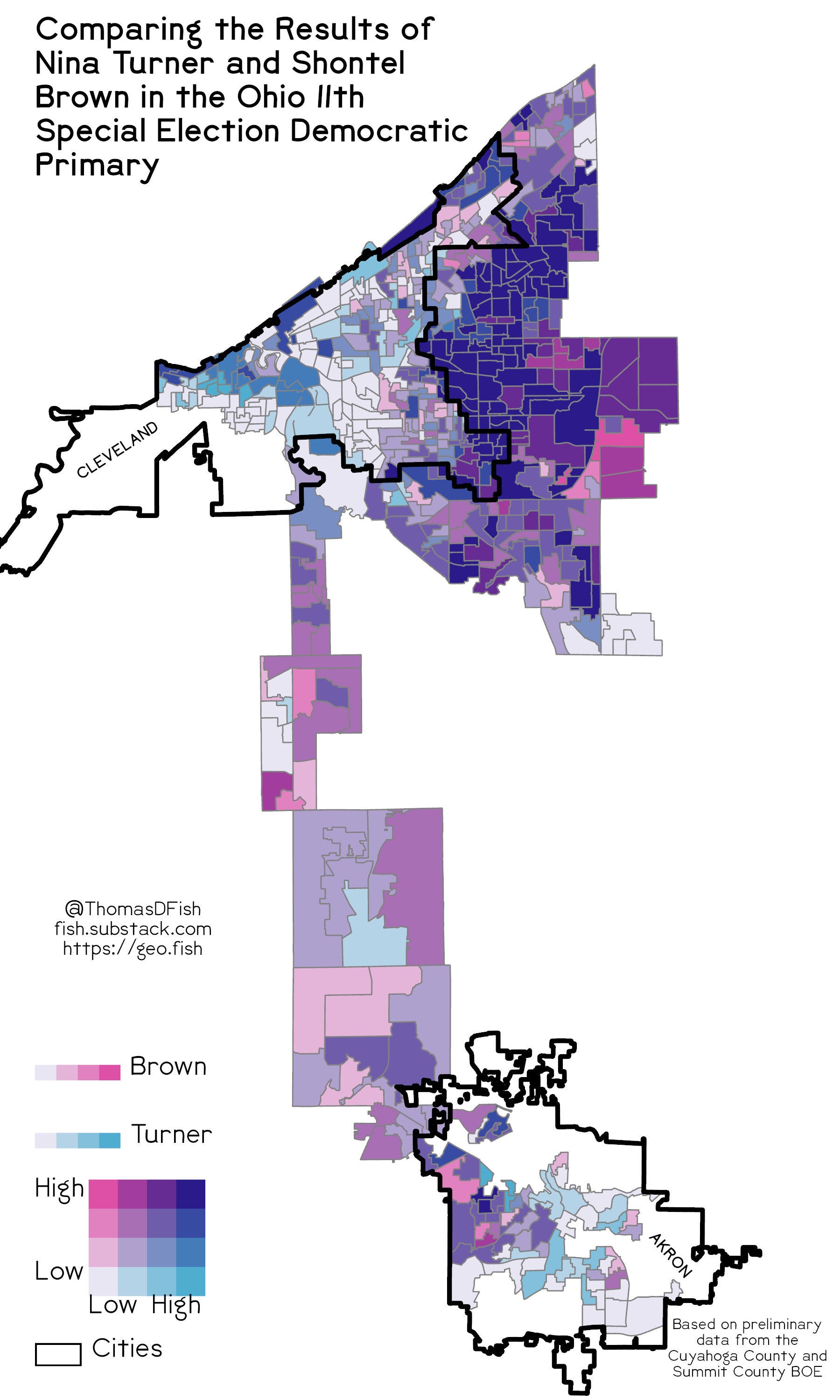
In this map, the more red an area is the better Brown did. The More blue an area is the better Turner did. The darkest blue areas are ones that both Brown and Turner received lots of votes from. You can see that there was a fierce fight through the eastern suburbs of Cleveland, but in the furthest east suburbs, Brown did the best.
Remember: people vote; the land does not.
Starting in October, I am doing substack and a basket of things full time, see the post below. Thank you to everyone who reached out for your support. Starting with this post, the data from my maps will be available to subscribers.

Maps from this post are available on Redbubble.
J. Miles Coleman and Drew Savicki are the two best-known accounts that I would consider to be part of Election Twitter.
Green your opponent did well, blue you both did well, magenta you did well.